Wednesday, October 21, 2009

Final Blog

And so ENDS the blog. This is my final post.
To begin. Heres some pictures.

I've finally done the pencils. After painting over them as many times as I possibly could! In my opinion they are painted differently to the rest of the painting. Maybe because other aspects of the painting have clear defining shape, where as my pencils do not...But I think if you stand back a little and squint. They look just fine. Besides if this is somewhat mild impressionist art, its all about human perception.

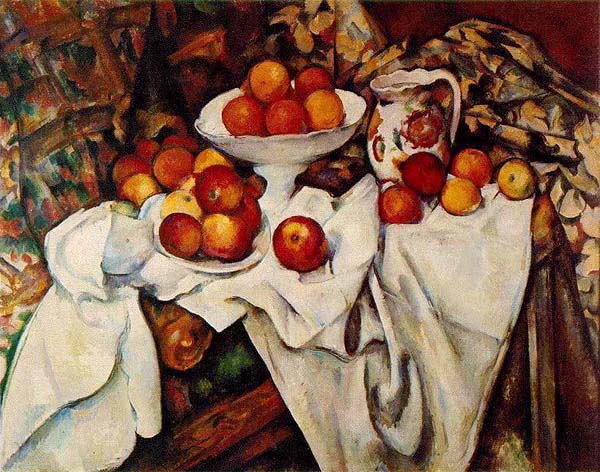
Some 'touch ups' to the ball has been done and I made the 8 more neater. I tried to make the transition from light to dark more clear butI somewhat failed in that attempt. But I'm satisfied with it.

Added some darker areas to the rubber to make them seem more 3 dimensional. That was a bit of a failed attempt also.

Wording has been added to the bottle. I wanted to change what the actual bottle said and put something personal in it. I could'nt think of anything. But I managed to make the wording sort of readible yet still paint it following the size of the text.

Signed it with my initials.

And here's it altogether. Not bad I suppose... I do like the background because although it consists of obvious and erratic brushstrokes, there is a clear and smooth transition from the dark points to the light. I also like the base in which the objects are situated as again the change in tone in clear and smooth. Unfortunately I believe I wasn't as successful with one aspect of the background. Chardin's works usually have light behind the objects that look almost as if they are radiating from them. This i somewhat accomplished however mine is more a transition from light to dark as you travel upwards.
I very much like the bottle. The shape is completely wrong and a bit strange however I like the reflection of light on its surface, although the labels are a bit messy.
The pencils are a little strange in its shape however they are much better than my first few attempts. Shadows beneath each object are appropriately placed and well defined.
Perhaps I could have utilized the space of the canvas better because the bottom bit seems a little barren. I prefer my use of more obvious brush strokes than my previous attempt to blend my colours to get a more realistic effect. Since I lack the skills for such a technique the erratic, obvious brush strokes are more appropriate.
I enjoyed my choice of objects because of their simple shapes (excluding how complicated the pencils were). I wanted to use objects that not only were relevant to the subject we are studying but had reflective surfaces or simple shapes (which I thought the pencils might have been, but I misjudged that!!!). And for the most part I do like the choices I made although I had a bit of trouble with the reflective surfaces at some points.
Oh yes. I accidently broke the 3 colour rule. I used black, red, white and green...dang...
In conclusion, while this painting is in my opinion not as good as I had hoped, it remains that I shouldn't over estimate my abilities . Painting is, and probably never will be an area in which I have strong points. I dislike painting which can contribute to my lack of enthusiasm for the area and result in poorly created works (but in this case it doesnt and its only the product of my lack the ability to paint haha). I'm glad this painting is finished. At the very least I am actually pretty happy we did this assessment as it teaches me that a paintbrush and I can never quite get along and I won't be tempted to use this medium again.

And the blog is finished. Wow that was a long assessment and I feel pretty tired.

Sunday, October 18, 2009

Laughs


This painting was done before our current one. Most people did this one I think. Or the pink one. Anyway this is mine. I dislike it. Not a very big surprise. But with all things consider I don't much appreciate many still life works to begin with.

Eisel


I should've made these posts on the day I actually did the painting. Anyway all that I did this day was paint the 8 of the 8 ball. Better than before, so I'm content.

Look at the mess I've made >.< ! I'll admit I just wanted to take pictures with my camera. You can see the side of the real 8 ball just peeking out at you from the left side of the picture.


I had the real bottle with me to help me paint the writing but I only managed an unsatisfying try. I painted over it and will start again.
Wow my room looks messy

Holiday work

During the holidays I admit painting was not my apart of my priorities. I was busy enjoying the free time with my own drawings and getting re-acquainted with my good friend the graphics tablet.
After 1 week of enjoying my holidays I spent a second week sick where I watched episodes of Bones and watched sleepy hollows 5 times. 2 of those times was in one day...How sad. And after that sad little chapter I decided to paint. I tried my hand at painting where I proceeded to (instead of doing the pencils and writing like I should have) paint out the pencil and restart on the shape, repaint some of the floor and background and make a great big mess by not being able to get the colours the same again. BRAVO.
Eventually I got the colours right and I ruined the shape of the bottle a little. Fixed it then tried painting the patterns of the bottle. I didnt like those so I painted over them. After 2 hours I realised my painted looked exactly the same except there was no pencils on it. I gave up that day.
The following day I got the following done.

The neck of the bottle is a little thicker to combat the fact it was leaning to one side. I have painted the lines for the patterns but their all thick and un even. Later I painted over them a little (show in next post) to make them thinner. I attempted to do the 8balls 8. It didnt turn out right so I painted over it and I am waiting for it to dry so I can redo it.

I decided not to painted over the pencils completely. Only the bits I needed to fix the most. I will paint over the pencils soon.

Erasers

The erasers were complete before the holidays. However I did forget to post images of it. So I am now.
The erasers were painted in class. And seeing as I already went to 4 colours not 3 in my painting (sighs) I painted them purely white opposed to the original where each rubber has a little cover around them. Not that that matters much.
The painting of the rubbers is done badly in my opinion. They are too...white? I don't know exactly what I'm trying to say about them but I think the shadows are done poorly. It remains that I sort of only like parts of the bottle. However now after I finish the writing on the bottle and the colouring of the pencils I will be finished.


And that is me in the process of painting over the pencils so I could re-do their shape completely.

Thursday, September 24, 2009

Weekend work

Okay from last weekend I got some work done. It was ALOT of painting.
It's different to the direction I first took. Initially I did consistant strokes in one direction. However I moved on to more wild brush strokes. That were more visible however aided in blending of colours. Oh yes. I explored more into the movement from light to dark tone. I hate painting. That took me a while. I tried making things look more 3d. Like fixing lighting and what not. FAILED.
Okay I took many pictures. I like the more wild strokes. Which is sort of not relating to my artist since I believe Chardin was more accustomed to delicate brush strokes. Anyway. Umm I also feel kind of bad for using paint I bought myself. Since it gives me an advantage in painting D: But I need those paints for my other paintings *sob* Waste not. Want not. Wait...does that apply... Anyway. Here are the photos I took as I went along with the painting.
Okay lets begin


Heres just a picture of the stuff I was using. Ignore all the paint. I didnt actually use that much of it haha. Haha Ipod.


The essential Paint brushes!


The ever important Ipod =D!

Lol now to really start!

I forgot to take a nice picture of the painting before I started...but oh well. So heres a pic of it after I started on the grey bottom bit.


And the following is a close up. Yet to be done is bottle label, bottle shape, background (green) eight ball...


And the following is where i painted white over some of the pencils because I was changing the shape and so i could paint the grey around the white.


Okay this next picture is when I started fixing up the eight ball. I fixed the white bit, painting the different tones and painted the black aswell and fixed its basic shape.


This next picture is of the rubbers which I didnt actually do that day.


This next picture is of the label being painted. Fixed up a bit =]


And this next one is of the pencils where I wrote 'fix me' on them because I didn't have time to fix its shape.


Heres the product of the weekend. As you can see the backgrounds been done also.


Alright I feel a little bit better about my painting. I like the variation in colour more...I still need to paint the rubber, pencil and detail on the label and eight ball.
The shape of the bottle in wrong. Which makes me really upset...And the labels are too high... The pencils are wrong aswell...Placed wrong aswell as the neck of the bottle should be a little thicker..I think O.o...Or maybe longer.My painting skills are bad. It doesnt look very 3d and lighting is bad...
I'll be taking the painting home for the weekend. More pictures will be posted with next post. Also research on some painters will be posted this weekend.

Saturday, September 19, 2009

A Grim Weekend

I wont post a picture of the progress because after i took the picture I realised I couldn't spot the difference. You can't really tell so its suffice to say that there was little progress last lesson. Due to the unfortunate and irresponsible (on my part) loss of ALL my paint brushes and my pallet. Someone threw it out D= or something. And I had the green colour on there that I needed D=
I'm allowed to take it home for the weekend. Hopefully it dries quick and I won't be hindered bringing it back to school on monday. Hahaha knowing how things are progressing recently I seriously doubt that it'll be easy for me. Well that and I doubt I'll get much of my assessments done.
Other than my cheery disposition, I'm happy that trials are over. I have time to work on English, religion and art.
The art assessment is progressing slowly, as I've imagined. I am of course referring to the theory task. I think, another week (and a weekend *prays to gods of manga* hopefully)of my prac and I'll be finished. Not satisfied. But finished.
I think I'm annoying people with my negativeness... My saturday classes have resulted in NO painting on saturday. I had to go city to buy paint and paint brushes as well. I murdered my paint brush case because some guy knocked me over on the train and it broke. I should've tripped him...Nah...But if that happens again...MENTAL NOTE...

Paint will be wet on Monday actually... So I'll go school REALLY early to avoid bumping into a crowd of people and smearing paint all over them and ruining my work.
Scanner still broken...I've given up on fixing it *typing this with ink stained hands*'

On an unrelated note
I read FRANKENSTEIN on the train around the city. It's good so far. I want to quote a bunch of things to people but I dunno if anyone's read it so they won't respond the way I want them to...
The book inspired some thought. I wonder how most people'd draw Frankenstein's monster...very large stature, stitching, protruding brow and bolts crammed into the poor creatures neck...I can't help but imagine a very cute monster... Even though its described to be a hideous abomination...Poor monster =[
Now I want to draw the monster but I think my image would be offensive to the book *thinking about cute monster with stitching and bolts*
Instead I prefer dreaming up images of Frankinsteins monster in the style of Gris Grimly.


Isn't it brilliant =D!? I'mma go look for his picture books! They are cute yet dark, creepy yet humorous. I like this bloke =D The image has nothing to do with frankensteins monster just fyi

Last note
I'm choking down smokey air...is there a bush fire about? Le gasp!

Sunday, September 13, 2009

Work so far

I love our art class. Everyones so positive.

HATE IT
It's not the whole 'Your, your worst critic thing' or at this point, utter self loathing. But honest to god, I can't paint to save holy hell falling down upon me and crushing my legs and arms so I am rendered crippled both physically and mentally which ultimately leads me to believe I have no purpose in life and eventually at a moment where I am at my weakest taking my own life in the confines of a old house in Japan where one day my restless spirit who haunts the house killing unsuspecting visitors will escape upon the world and destroy all those who generally have the characteristics of the stereotypes who usually die at the beginning of every lame horror movie.
*deep breath* hint hint just watched 'the grudge' again for the millionth time. Could you tell? Bad horror movie . Funny though.

Anyway I want to fix the background but at the point it's hard since I can't seem to produce the same colour which is just making it look bad...well worse.
I just realised... is my bottles neck leaning over to one side? o.O. Dang... I still need to paint the rubber and the detail on the bottle, fix the pencils and fix the 8 balls shape a tad.

scanners broken....

Monday, September 7, 2009

Art


Got the ah..well we already did alot of this assesment but this is like the official assesment.
I'm tired....
Next week is trials. So basically I'm not starting to trials has finished. And thats in like what...? 6-7 days. There goes a week. Bleh I need to cram. This assesment is making me uneasy. Although I don't want to do a podcast or a video i also really dont want to do an essay D:
I'd like to make another website. So it sort of matches my VAPD =D Besides I'd like to try my hand at the coding of websites. Maybe I'll ask miss...
Anyway animania was really fun. I really enjoyed chasing after cosplayers and looking at all the stuff even though i did over spend. I entered the drawing competition but lost. I have no skillz D: Actually it was worse than my normal drawings cuz I didn't have a pacer and the rubber sort of sucked but yeah I'll post a quick pic of it.
lol okay you cant really see that but whatever. The arm lengths seem weird. She loooks like a guy. Dont get me started on the hands and her boobs are lopsided. hahaha whatever

I spent the whole day looking for one guy. Yes like 8 hours looking for this one guy dressed as Dante from 'Devil May Cry' because I really wanted to get a picture taken haha XD. Wish I could post a picture but you know, not allowed without permission. I wish there was a Vergil. But noone can pull off Vergils pure awesomeness and equal his epic ability of being made of total WIN. He's my fave. But Dante's ADORABLE too =D

By far my fave costume of the day!

]Anyway Angela and I blew cash buying these stuffed animals. Mines gloomy bear (bear with blood on claws and mouth) Hers is ....forgot his name... but the cute bunny from the manga GRAVITATION.

THIS IS THE PICTURE I WOULD'VE VOTED TO WIN!!! ITS MADE OF TOTAL WIN =D!! EPICNESS!
Hahaha no I'm serious it made me laugh heaps. But I guess you'd only get it if you saw the person with the orange sign. Otherwise nevermind.
But yeah awesome XD

Still havent fixed scanner D:


End this by posting picture of my puppy!
She went swimming =D

Sunday, September 6, 2009

Quick Post.

I painted the background. Couldn't get the colours right. Which I predicted.
My paintbrushes have gone missing. First I lost 2 of the 5 in the boxes and there were none at the bottom of the box.. I should've maybe put them in a pack that was better sealed than the open packet... I lost another in the last lesson. I've stupidly lost them... I've got to be more responsible... *sigh*
Well anyway...
The background colour seems darker and not quite as nice as before. While even and painted okay, they aren't as nice a shade. Which is a shame.
Fortunately I was able to paint around the objects I have done. Which I realise now it might have been in my best interest to paint the background and base bit first. It doesnt matter since I managed to paint around.

On a lighter note...
Went to animania this weekend with Angela and Jessica and it was really fun.
And my sister made me help her to put up her artwork at lunch for twilight evening. Cept i stood there with a hammer when she searched for a ruler and she didnt actually put anything...waste of a lunch time but it doesnt matter I wanted to get a look at the year 12 art works. They are lovely.

Thursday, September 3, 2009

Nothing to do

I've squandered time by sitting here and only blogging since we've run out of oil and i desperately need some. So I basically TIME WASTED for painting. Which is sad because I'm really behind. I need to finish this assessment. I hate painting so I want to finish as soon as possible but then again I don't want to rush and make it look bad. If I was able to take it home. I'd be finished in a day. However I'm not allowed....
The internet was not working as well so instead I worked on writing out some of the information I had on my tabs. It was mostly work related to Peter Claez. Which I decided will be one of my four artists I do some research on. He's the last one I wrote on. (Meaning another thing about them that was on the checklist but I haven't really written on prior to this post).
Here's more information


Paul Cézanne


'Self Portrait'

Paul Cézanne (1839-1906) was a post-impressionist french painter and was born in the south of france. At 10 years of age, Ce’zanne entered Saint Joseh school, where under the guidance of Joseph Gilbert (A spanish monk) he studied drawing. He then went on to enter the college Bourbon where he continued the study of art. However he later went on to study law in the University of Aix at the direction of his father, however during this time he continued to receive drawing lessons. He eventually objected to his fathers wishes ad pursued his artistic endeavors. Initially his banker father did not support his Ce’zannes choice of career, however eventually they reconciled.
Ce’zanne contributed widely into changing art styles during his time period. Ce’zanne is credited also for forming the bridge between the late 19th century Impressionism and the early 20th cenury’s Cubism.

His work demonstrates his refined mastery of design, colour and composition. Unlike the works of Chardin, his brush strokes were not soft but rather clear, often repetitive and bold. While Paul Ce’zanne painted still life, he did not limit himself to it. Ce’zannes paintings deals with human visual perception, where he employs the use of many small brush strokes of specific colours to form his images. He employs the use of a multitude of techniques in his works that feature common household items to create beautifully structured still life.

'The card Players'


Both paintings by Ce'zanne embody his impressionist art. He uses many small and large brush strokes in creating variation in colour and composition. Both works show use of repetitive brush strokes often with a variation of very specific colors (such as the red and yellows in 'Apples and Oranges' or the darker colours in 'The card players'. His play with lighting and shadows gives a 3 dimensional quality to his paintings. His works deal with visual perception so the use of an array of small brush strokes create texture such as the clothing of the card players and the surface of the peaces and apples.


'Apples and oranges'


Peter Claesz


Peter Claesz, was a Dutch still life painter. He was born in Berchem in 1597. He later made a permanent move to Haarlem in 1621 as it was the home of many highly regarded artists who benefited from the wealth of the towns citizenry.
He painted highly realistic works with an extraordinary sense of naturalism. The miniscule and accurate detail he endowed onto his canvas create beautifully textured and consciously arranged pieces of art. His palette consisted of monochromatic (similar colours) colours although his later works were bright, colorful and decorative. While most of his works were of modest size, Claesz also painted large extravagant and decorative scenes of attractive feasts.
Claesz demonstrated a mastery of handling light and texture favoring the use of ‘homely’ objects. Claesz still life's often suggest that there may exist hidden meaning, often depicting skulls, a known symbol of human morality. However many other aspects of Claesz’s paintings, including fruits, are possibly forms of allegorical symbolism.

'Tabletop Still Life with Mince Pie and Basket of Grapes'


In all his works as well as 'Tabletop Still Life with Mince Pie and Basket of Grapes' and 'Still Life with Roemer and Oysters' Claez demonstrates his attention to meticulous detail and demonstrates his ability to duplicate the texture of the object. You are able to see individual grains, depressions and the courseness or smoothness of an objects surfaces. This is demonstrated in such things as through the depressions in the lemons surface (above) and the grainy surface of the bread (below). His works appear very 3 dimensional and appears as if you can seemingly interact with his work giving one the impression that you are able to touch the variations on its surface.
He clearly embodies in both artworks the movement in which his art works have been influenced (naturalism) demonstrating his aim to make his works as realistic and incredibly detailed as possible to the point of painting the individual grains (from the oysters below) in great detail.


'Still Life with Roemer and Oysters'


I feel its appropriate to talk about my own painting now.
I am not so bold to try any forms of radical impressionist art and I don't have the skills for naturalism or realism art. Even though I intially wanted to make my painting a realistic piece to follow the style of Chardin, it was ultimately a lost cause. There is a great degree of skill required in creating a realistic looking piece. It requires masterful brush strokes, being conscious and smart about choice of colour and use of lighting.
Impressionist art while bolder with obvious brush stroking, sometimes miniscule and detailed, require again to be conscious in use of colour and lighting and size and shape of brush strokes. Rather than creating an accurate and detailed depiction, impressionism deals with more the capture of moment, lighting and effects of colour.
To follow more modern forms of art I lean towards the use of bolder brush strokes. My own work deals with erratic brush strokes ranging from large to small strokes and is not detailed nor accurate.

Tuesday, September 1, 2009

TODAY IN ART >=D

MY CONJOINT TWIN! DRUM ROLL PLEASE >=D!! BRALA!!!
brala taged here and she lurvs her conjoint twin :):):)

Anyway. Today is ART CLASS. We painted despite Ms.D not being there. You didn't miss much. no worries.
We were restricted for time so I didn't get much painting done. And we had to pack up early since we had a in-class assessment the very next class. So we packed up much too early so I didn't even get my first layer of my background down D: And now the paint will dry and I wont be able to get the same colour.

And heres the work I got done in class.


Because I realised I could'nt duplicate the colour and it was a waste of time this lesson I sort of just scribbled paint on the canvas. No harm done. I have to paint over that. I'm a bit sad I know I won't be able to duplicate the colour... I like that colour, its the colour of my room and is quite lovely (in my opinion). And it also makes me realise even the background of my painting in some way represents what I find beautiful (laughs). Although that has nothing to do with the ACTUAL thing we are doing (sighs)

Monday, August 31, 2009

Work information

Jean-Baptiste-Siméon Chardin

Jean-Baptiste-Siméon Chardin was famous for his classical still life art, having been born in Paris in 1699. The 18th Century artist is widely considered to be a master of still life.
He was largely self-taught however studied under supervision of modest artists, beginning his career by painting sign posts. He was influenced by realism and subject matter which was the style at the time. Like all the still life artists at the time he painted common domestic scenes. These pieces were favored among the rich despite still life not being the prevailing art style at the time and were known for their beautifully delicate and aesthetically pleasing imagery.
Chardin favored simplistic works with delicate brush strokes and masterful uses of light and textures. He favoured simplistic items, however he was able to portray the nature of the subject through his paintings (i.e glass or material). Despite historical art being the prevailing style at the time, Chardin continued his works with still life and was even able to gain an appreciative audience.


For the majority of his life Chardin’s work was successful. His work, specifically presentation of 'They Ray' was later discovered by Nicolas de Largilliere which led to Chardin’s admittance in the Academie Royale. In 1724 he became a master in the Academie Royale. In his early career, Still life was the principle theme of his works however later on he began genre painting in 1733 to around 1751. From 1751 he began to paint still life again.
In later life Chardin’s sight began to fail him so he took up the use of pastels which he then used to make beautiful portraits.


'Basket of Wild Strawberries'


In both artworks Chardin demonstrates his ability to create realistic works of art. Both 'Basket of Wild Strawberries' and 'Basket of Plums' demonstrate Chardins ability to create amazingly textured still life where the surface of such things as the fruit (seen in both paintings) are duplicates of the original and appear very 'touchable'.
Chardin demonstrates his ability to play with lighting. Most of his still lifes appear as if light is radiating from behind the subject bringing attention to the central theme. He creates very 3 dimensional pieces through use of lighting and shadow.
Chardin uses very simple geometric grouping as is demonstrated through such things as the triangular form of the stack of strawberries within 'Basket of wild strawberries' and the triangular form of the stack of plums within 'Basket of Plums'.


Basket of Plums


Yasumasa Morimura

Yasumasa Morimura was born in Osaka Japan in 1951. He graduated from Kyoto City University of Arts and is known for his solo exhibitions which consist of various works of his that are appropriated images of famous works of art. Morimura's pieces consist of his face or features of his face appropriated onto various famous artworks and photographs.
Morimura's works range from Eastern to Western arts and demonstrates an obvious unique and unusual expression of beauty. Using forms of digital media Morimura reconstructs a famed artwork of beauty and interprets it according to the meaning or purpose he perceives from the image.

Among re-creating paintings and photographs, Morimuri recreates the textures of the originals often by phsically applying elaborate makeup to his features to get the desired effect.

"Art is basically entertainment. Even Michelangelo and Leonardo da Vinci were entertainers. In that way, I am an entertainer and want to make art that is fun." a quote of Yasumasa Morimura that somewhat gives us an insight to the unique designs of his work.
MoriMura's works are strange yet unique and interesting. Morimura's work stand as more than a testimony of good fun but also demonstrates his love of art and attention to great detail. Morimura's works of appropriated artworks are not simply just replacing the faces of famous works with his own but show his ability to duplicate the expressions and actions of the original in meticulous detail. Such as in his rendition of Marylin monroe, not only does his stance and outwardly appearance mimic hers, his expression attempts to also follow the original in great detail. Alike this his appropriated works of famous paintings(in reference to the image below) mimics the subjects seriousness, however betrays a sense of good natured fun.
By inserting his face into famous western art works, many consider it as a message of 'settling the score' with the dominant western colonizer. His works often ask his audience whether the western icons would be as attractive were they of a different culture. Many believing that his works not only criticize western icons but pay them tribute also.